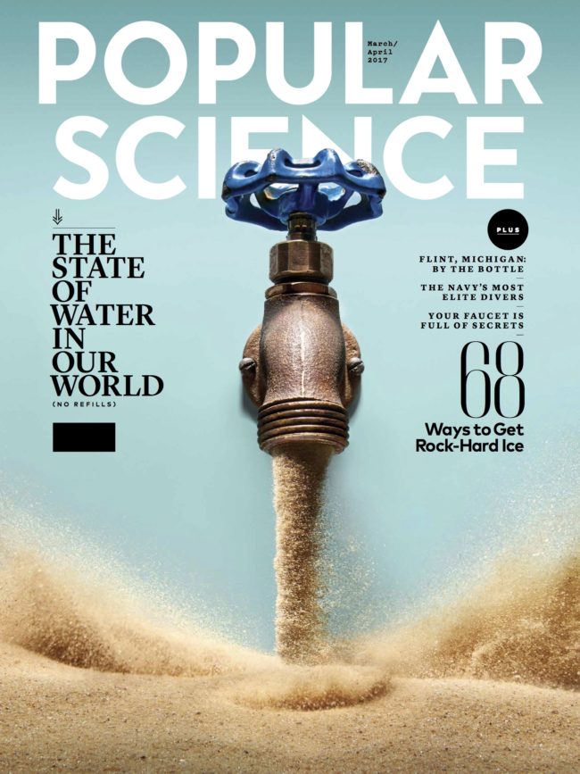
 The mandate was clear – “No glasses of water!” That was the primary instruction from the editorial team at Popular Science to the photography team who would eventually shoot the photos for the recent issue on the global water crisis.
Heidi Volpe interviewed Adam and Robin of The Voorhes and shared the process in a Photo Editor.
“The whole issue is about water, the future of water, and in great part water scarcity,” notes the duo. “So the obvious is to do a play off of a glass of water, right? But we were given specific direction to NOT photograph any play on a glass of water.
“Adam couldn’t help but to doodle a glass of sand. The simplicity of it and the quick read was a draw. We also had sketched a faucet with fatter willing the bottom part of the page, and type was starting to break loose and float. We presented a bunch of ideas to the magazine, some well formed and some loose bits of ideas. They came back with the thought of sand replacing water in the faucet sketch. It was a totally collaboration. A mash up of brains and ideas.”
That mash up is the result of hours of preliminary work, with as many as 30 initial ideas being tossed around. And once the direction is decided, the real work is just beginning. Bags of sand that had to be tried, digging through a recycling yard to find vintage faucets, myriad details like lighting, color and layout…the inside look at the process is just fascinating.
The work paid off; the Popular Science cover for April is what the best covers should be: powerful, compelling and able to say so much without words.
Great covers aren’t magic (although the truly great can seem like it); they are the results of the best teamwork in editorial, design and imagery. This one ranks right up there.