[responsive]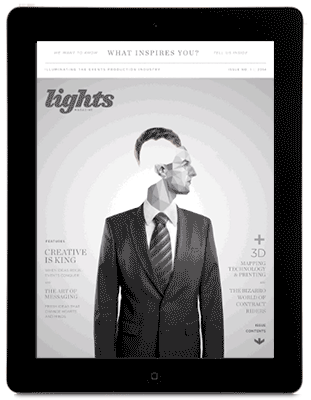 [/responsive]One of the criticisms we hear of replica digital magazines is that they don’t leverage any of the interactive benefits of digital but simply recreate the print magazine. Readers aren’t loving this solution, and simply reproducing the print magazine cover as it is seems somewhat…lame.
But how interactive or varied should the cover be? This is a key issue in designing for digital magazine covers. D. B. Hebbard put that question to a number of creative types in the industry in his App Publisher roundtable, and got some pretty interesting answers.
“I think you can do whatever you like for a digital magazine cover… its really just something the user sees as a ‘poster’ really – so perhaps turn it more into a contents page – or something completely different – one image with no words,” digital publishing consultant David Hicks told Hebbard. “I think too many designers stick to what they know – ie: print covers. It just looks lazy, to be honest.”
Another point of view has to do with discovery, as Chris Bond of TC Media notes.
“Unlike a print edition, the reader can’t pick up the edition and flip through it before deciding to purchase,” said Bond.
“Cover videos give us the opportunity to give the reader a bit of that ‘flip through’ feeling by bringing to life what they’ll get inside. While such elements help to amplify the value of the content, you don’t want to overwhelm the reader with too much different kinds of interactivity,” Bond continued.
The best solutions, we believe, don’t try to replicate the print style newsstand look. That is simply not appropriate for digital content. Some use a combination of print style then scroll to a digital interaction, which is nice, and gives the reader both the pull of a striking cover image with the discoverability of an interactive TOC.
With the industry still figuring out how (or if) they can make digital magazines work, the field is wide open for creativity. What’s your take?