 There’s so much to love about print magazines. The feel of the stock, the smell of the ink, the way a deep read in print draws you in. Part of the standout experiences in print magazines is, of course, the artistic design.
The very act of creating a physical publication is constricted in some ways by the dimensions of the page. And this tends to inspire an extraordinary amount of creativity in design. It’s what makes the magazine industry so fascinating; and that’s why we love sharing stories of redesigns and how they come about.
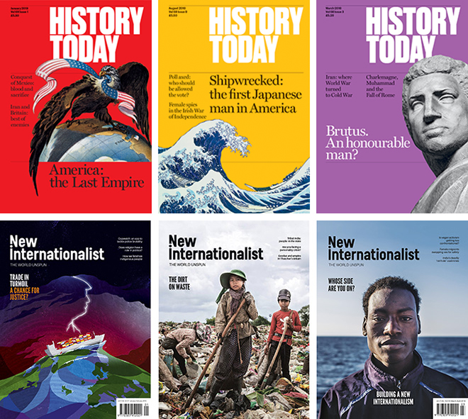
“Two long-standing magazines have recently redesigned, taking inspiration from the energy that the new wave of independent magazines has provoked,” writes Thea Smith in MagCulture. The team there wanted to take a deeper dive into the stories behind the redesigns of New Internationalist and History Today, and spoke to the team behind each.
“The team at History Today, established in 1951, looked back at its rich history for inspiration and took inspiration from the very early designs of the 50s and 60s, as well as academic journals, in order to differentiate from other magazines on the newsstand,” Smith writes. “They worked with design agency Esterson Associates over a six month period on the compact redesign which first hit the shelves in May 2017.”
The results are beautiful — a look that is both serious yet contemporary as HT’s art director Holly Catford explained about their complete overhaul.
“I looked a lot at the history today archive, they were originally much smaller and journal-like. We changed the size, grids, fonts, paper, printer, everything! That doesn’t happen very often in redesigns, it was really fun, but also quite hard to work from a totally blank canvas,” Catford explained.
And while they are a history magazine, they didn’t derive their inspiration exclusively from the past.
“Kate Wiles, Senior editor, told me that they also looked at contemporary titles such as Lapham’s Quarterly and Delayed Gratification, which are smaller in scale and suggested a slower, more heavyweight read,” Smith explained.
Another well-established title, New Internationalist, took an aggressively creative approach to the entire magazine with input from their readership.
“We threw everything up in the air,” said Hazel Healy, co-editor.
“We consulted our readership, then we whittled down ideas until all the editors agreed. The final result was a much better balance in terms of pace and content,” Healy continued.
A common thread in these redesigns is where new ideas come from: The indie magazine niche, where titles are often forced to even tighter constraints, offers up fantastic ideas on layouts, font choices and editorial strategies to tell compelling stories that flourish under constriction.
If you’re considering a redesign for your own publication, know that it’s a challenging process. But in the end, it can be well worth the efforts.
“This redesign says that we’re a magazine with a long history and cutting-edge ideas,” said HT’s Wiles. “The most surprising response came from those who, even though the editorial line had not changed, thought it had because the articles were packaged differently! Our goal in the redesign wasn’t to reach new audiences, but to re-establish our place among our peers; the new design makes us stand apart and showcases the exciting and original history we publish.”
Take a look at the new designs, and see if they spark some ideas for your own publication. The inspiration is everywhere!