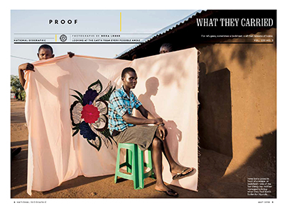
When your brand look is as iconic as National Geographic’s, you tread with care when it comes time to redesign your flagship print magazine. That yellow rectangle, after all, is arguably one of the most recognizable brand marks in the magazine industry.
The next iteration of National Geographic
 “Maintaining a 130-year-old publication’s place among the world’s most relevant and widely read print magazines means getting a lot of things right,” writes Greg Dool in Folio. “But it also means recognizing an opportunity to deliver readers more of what they love, and not being afraid to adjust the formula when the time comes.”
That time is now, as National Geographic’s May issue hits the newsstand a week from today. The new look, Dool reports, includes upgraded paper stock, a new “front-of-book” section, and even more room for the iconic visual storytelling that is such a hallmark of the NatGeo brand.
“National Geographic has helped readers explore the world for 130 years, and we thought it was important to move forward by embracing our heritage in new and modern ways,” said editor-in-chief Susan Goldberg. “The new National Geographic delivers the same sense of wonder readers expect but with a bolder, more provocative, more captivating eye.”
It was less about changing something that people love than just flat out giving them more of it in a better way.
As Dool notes, this is not some desperate attempt to change to stay relevant in the digital age – their newsstand sales are in fact up 16% this year. Instead, they are giving their readers more of what they do so well.
“Our readers and peers are telling us loud and clear that we’re making a vital magazine,” creative director Emmet Smith told Folio. “So, in our tinkering, we sought to identify those things that we do better than anyone and double down on them. It was less about changing something that people love than just flat out giving them more of it in a better way.”
A new focus on wellness for Shape readers
 This idea of giving readers more of what they want in print is behind the recent redesign of another iconic print title.
“Shape has redesigned its print magazine to include more wellness and holistic content, leaving workout instructions to its digital platforms,” writes Sara Guaglione in Publishers Daily.
With broadened verticals that move well beyond the workout and fitness content of their previous version, Shape is now taking a more comprehensive look at women and their lifestyles.
“I don’t want to tell women what to do, how to look, how to feel. I want to give them ideas and they can experience it,” said editor-in-chief Elizabeth Goodman Artis. For example, the previous “Eat Right” nutrition section has been replaced with sections called “Be Food Curious” and “Be Health Wise.”
“I don’t want to tell women what to do, how to look, how to feel. I want to give them ideas and they can experience it,” Artis said.
A major change in the content is moving its fitness material — like workout tips and routines — onto the website, leaving more room in the print magazine for more inspirational and lifestyle content.
“The May issue looks at the science and experience of fitness, rather than actual workout demonstrations or instructions,” Guaglione explains. “One feature of the magazine explains the science behind high-intensity interval training and why it works for so many people.”
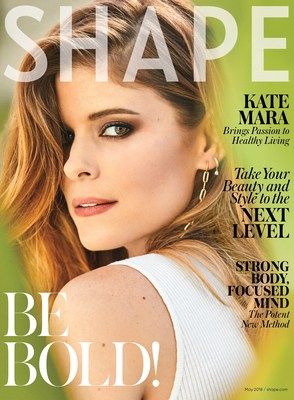
This content draws people to the site for videos on interval training workouts and other fitness help. Look for the redesign to hit the newsstand in May … but don’t look for the traditional bikini-clad model. This issue will feature a (fully clothed) Kate Mara, to introduce the idea of overall healthy living.
“I want to bring out the personality [of celebrities] and who they are and what they feel comfortable in,” Artis said. Guaglione notes that Artis believes it’s important “not to reduce women to their body parts” on covers.
Magazines continue to surprise and delight when they evolve with their audience in mind. We’ll watch for both of these issues, and hope you do too.
