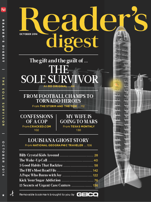
[responsive] [/responsive]Launched almost 100 years ago in 1922, Reader’s Digest is arguably one of the most successful magazines on the planet. And it’s undergone a facelift recently, with the new October cover unveiling a bold new look.
As Casey Welton notes in Folio:, “Last year Reader’s Digest reimagined the design of its nearly 100-year-old magazine. And several months later, design director Dean Abatemarco is confident that the new design vision has hit its stride.”
Among the changes were the way the logo was handled, and the tear-off flap bookmark.
“…a real challenge was the color of the flap. I was really pushing for black on black,” says RD’s design director Dean Abatemarco. “But it presented a technical snafu. We really wanted to do a varnish on the flap but it was just too expensive so we went with a slightly cheaper version that allowed for an offset between the flap and the cover.”
With any major redesign, the industry is weighing in. Welton includes some expert testimony from heavyweight designers Adana Jimenez of RANGEFINDER and Dave McKenna of 5280.
“Reader’s Digest’s decision to change its logo by making the word ‘Reader’s’ more prominent was a great choice. It just makes sense,” says Jimenez. “In my opinion, ‘Digest’ is not a very sexy word, but when it interacts with the letter R it becomes solid, anchoring nicely on top. The logo maintains a classic look, but is still approachable and—dare I say—fun!”
McKenna throws his opinion into the mix:
“The redesigned logo is a bit of a nod to its history and feels classic and timeless—pretty serifs, emphasizing that yes; these are collections of edited stories (hence ‘digest’),” says McKenna. “The word digest also sits on the flap; more obvious on some other covers I’ve seen this year, which leads your eye to the table of contents and gives the design intention.” (He also notes that he’s still “coming to terms with” sponsored logos on the cover – this one features Geico.)
Overall the look definitely finds that nice balance between brand recognition and an updated vibe. Nicely done, RD.
