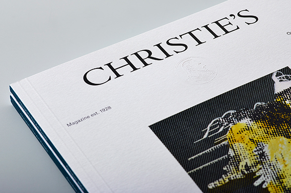
 Christie’s archives go back more than 300 years, and their new magazine design team dug into the time capsule to get inspiration for their new look.
The makeover is the brainchild of David Mckendrick, formerly of Esquire, and Wallpaper’s Lee Belcher, who have together formed a new design house called B.A.M. (Yes, the inference is quite intentional.)
Rob Alderson of It’s Nice That spoke to Mckendrick and chronicled the process of how the new Christie’s magazine came to be.
“[Mckendrick and Belcher] have redesigned the august auction house’s publication into something ‘clear and concise, elegant and sophisticated’ and have actually split the title into two; one magazine carries editorial features and the other is a more hard-nosed look at up-coming sales and auctions,” writes Alderson.
According to Mckendrick, he and his partner “have a very similar, unpretentious, approach to art direction and design, but we bring different skills to the table that make each project better for it. We have different practical strengths too, but having the same strong beliefs about what good design and art direction is, makes working together easy.”
The magazine, Alderson notes, took six hard weeks of nearly non-stop work to get where it is now. As a first project for the fledgling but powerful design team, it had to be good.
“We had to be on it 24/7, from leaving Esquire and Wallpaper on a Friday and hitting the ground running on the Monday with the redesign,” recalls Mckendrick. “It was also our first job as B.A.M. so it had to be up to scratch. We got some of the best photographers and illustrators on board too which takes quite a bit of effort.”
The results speak for themselves: the magazine is stunning in its elegance, striking like the art and other treasures offered on its pages, with rich and highly readable editorial content that supports the commercial side beautifully.
We love to see this kind of creativity, based on solid foundations, in print work. Kudos and much success to the team at B.A.M.
