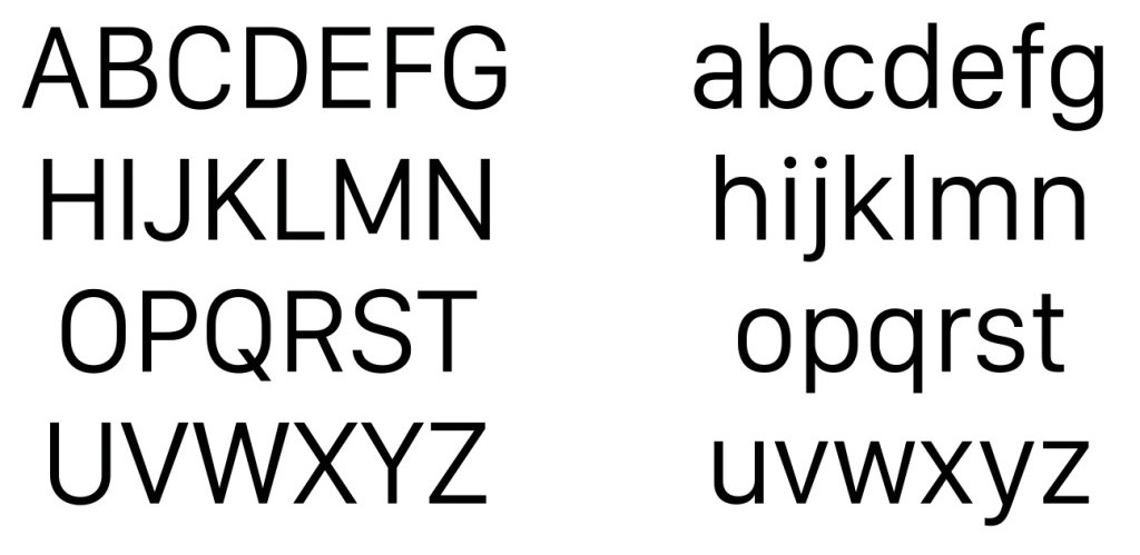
The letters were designed to be optimized for the Apple Watch’s small screen.
Has Apple lost it in the font design department? According to some design fans at WWDC this week, you can forget the Apple news app or the long-awaited debut of Apple Music. The big shock is the subtle-yet-all-over-the-place unveiling of Apple’s new font.
“After two rocky years as Apple’s typographical identity, Helvetica Neue is being replaced by a bespoke font, San Francisco, as the default font on both OS X El Capitan and iOS 9 this fall,” notes Liz Stinson in Wired.
“San Francisco is the first in-house typeface Cupertino has designed in more than 20 years. With its clean, compact shapes, subtle roundness, and ample space between letters, San Francisco was no doubt designed for maximum legibility on the Apple Watch,” Stinson continues. “But at WWDC yesterday, amid the hoopla around new operating systems and streaming music, Apple snuck in another development: San Francisco was always meant for more than the Watch’s tiny screen. It was designed for your phone and desktop, too.”
The announcement was not so much made as implied, as attendees received jackets embroidered with the new font, and jumbo-screen presentations where done up with the fresh look. Many designers are not impressed.
“Apple is really, really behind when it comes to typography,” says famed German typographer Erik Spiekermann, rather harsh words for the company that has become synonymous with iconic design.
The prevailing view seems to be that the font update was necessary for maximum readability on the Apple watch and other tiny screens.
Stinson references an interview with WIRED’s David Pierce in which Alan Dye, Apple’s head of human interfaces, explained how the typeface was optimized for the Watch’s tiny screen: “That led to the typeface that’s a little more square, but with gentle, curved corners,” Dye said. “At the same time, it’s very condensed. It also had a taller x-height, which means the lowercase letters are taller, which makes it a little more legible.”
This is the second change in two years for the company; they shelved Lucida Grande back in 2013 in favor of Helvetica. And now this.
“Seeing it change is jarring and disorienting, like coming home to find that the walls in your house are now a different color,” typographer Tobias Frere-Jones says. “So it’s unfortunate that Apple will be changing their interface typography again, so soon after introducing Helvetica.”
Is it a critical error in design judgement, or a necessary nod to technology?