 NYTimes Magazine art director speaks on why it’s critical to rein in political bias in cover imagery, especially during a charged election cycle like this one.
Most of us understand the idea of journalistic integrity as it relates to written content (although certainly not all practice it). The concept applies to graphic design as well, adding challenge to the art direction of a title like The New York Times Magazine.
“Impartiality is not an issue most designers have to contend with, even less so journalistic integrity. Those who practice their craft in ad land know coercion is king, the manipulative power of imagery a tool to be used with abandon. In fact much of commercial visual communication exists to sway an audience: buy this product, engage with this app, trust this service provider, vote for this candidate,” writes James Cartwright in the AIGA Eye on Design blog.
For most commercial designers this may be true, but not so for the artistic team at The New York Times Magazine, headed by design director Gail Bichler. Her team abides by the same code of ethics as the journalists, with a focus on the “importance of checking facts, the exactness of quotations, the integrity of photographs, and [a] distaste for anonymous sourcing,” Bichler notes in an interview with Cartwright.
Rather than being a limiting factor, Bichler considers this a privilege.
“There is a real sense that you’re putting something out into the world that so many people are going to see and respond to, and there is a sense of responsibility in terms of being truthful, representing things fairly, and coming at it with level of maturity. Those are all things that are part of the approach, and there are a lot of checks and balances in terms of how things get approved here. It’s a pretty thoughtful process,” she explains.
Of course, given the fact that readers bring their biases to the experience, it doesn’t always work flawlessly, as evidenced by the crazy response to the Hillary – Moon cover from 2014.
“One of the main critical objections was that the depiction of Clinton was sexist, as no male politician would be caricatured in such a ridiculous way. Of course Bichler has numerous examples of covers upon which the Times has satirized prominent male politicians, but the facts of the matter failed to mitigate the uproar,” Cartwright notes.
Bichler understands that the potential for controversy is part of the territory.
 “Covers are meant to generate excitement and buzz, and if people are talking about it then there’s interest in your magazine. While I don’t subscribe to the idea that all attention is good attention, it’s exciting that people are interested in talking about them so much, because if you put something out there and nobody’s interested in it then that’s not a good thing.”
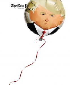
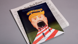
In this divisive election cycle, it’s interesting to understand the thought process behind the media’s choices, in both editorial and art decisions, as both sides shout “media bias” and stand poised to foment controversy. We give Bichler and her team a lot of credit for managing this situation day in a day out with originality and creativity.