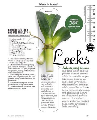
 How do you want your readers to experience your publication’s content?
That’s the key question that a managing editor needs to ask before each issue, according to the folks at Picante Publications in their article “Magazine Design and the Beauty of White Spaces.”
“For many magazines, the editorial content comes first in the minds of readers. Particularly for news-heavy, informative periodicals, readers pick up a copy expecting editorial substance and (perhaps) a good deal of intelligent commentary,” the article continues. “For other publications, readers may value the visuals, photography and overall design feel just as much, if not more than, the editorial content.”
Understanding the overall experience, from the reader’s point of view, is critical. And when it doubt, air it out.
“To a designer, a magazine layout is somewhat like a puzzle: There are a certain number of pieces, and everything has to fit together within a finite space to create a cohesive, attractive overall picture. Text, drop caps, photos, infographics, pull-quotes, sidebars and any other appropriate design elements all need space to thrive — not merely to fit — within a design. Try to pack too much in, and you’re probably going to end up with a cluttered, cramped design that won’t be very pleasing to the eye or enticing to interested readers,” the article continues.
Enter white space. As any good designer knows, it’s so much more than simply the absence of an element. White space should be approached as a design element on its own merits, one that adds balance, separation, cleanliness and flow.
“With so many elements competing for positioning, it might seem counterintuitive (and even wasteful) to throw empty space into the mix, but thoughtful use of white space can make all the difference between a mess and a masterpiece. Empty space also helps to establish a visual hierarchy in a design, silently telling the eye where to focus attention first, which in turn will make reading a much more enjoyable experience,” the article notes.
The article offers an excellent case in point in Energy of the City magazine. They call it the “less is more” approach, and the design elements – including white space – work together beautifully.
So as you approach your next issue from a content point of view, consider the role of white space in your hierarchy, and what it could achieve. Sometimes the ink we leave off is just as important as the ink we leave behind.
