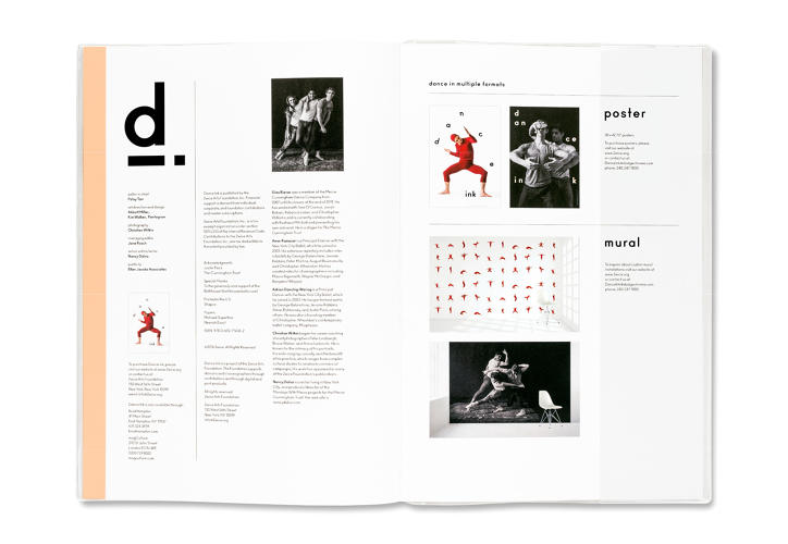
 Can a static magazine really dance? If it’s Dance Ink it can, with content that leaps from the pages.
It gained cult status in the ‘90s, and for good reason. Dance Ink magazine was somehow able to capture the movement and energy of dance and translate it to the (gorgeously printed) page.
“Published by Patsy Tarr, a philanthropist and currently the director of the 2wice Arts Foundation, the magazine was developed as more than just a way to document dance performances—it was also a performance in and of itself,” writes Meg Miller in Fast Company’s design blog.
Art director Abbot Miller likened his work on the publication to the act of dancing itself.
“There’s someone who choreographs the dance and performance and then the designer, who choreographs the experience of the design on the page,” he said.
By 1996, the music stopped for the publication, but it’s being revised now for a new generation, with Tarr and Miller again at the helm at Pentagram. And Dance Ink once again leaps off the page.
“In the new issue, Miller also used printing and typography to convey movement,” Meg Miller explains. Even though most of the photography is in black and white, like the original Dance Ink, Miller layered the back typography in cyan, magenta, and yellow to give the type the appearance of movement. Rather than laying it out in straight lines, the text is often undulating, giving off a sense of motion as well.”
It’s fantastic to see Pentagram relaunch this beautiful piece of work; it’s edgy, gorgeous, contemporary and classic. We wish them success in leaps and bounds.
