 In type design, it’s all about the nuance, the little differences that set the tone and feel for a font family. This week, our two free font choices are great examples of how subtle changes can make a big impact.
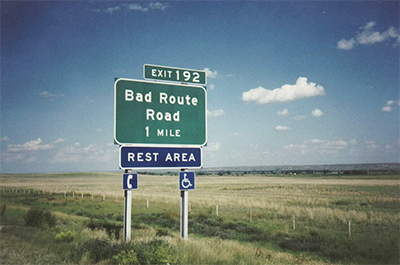
First up is Overpass, designed by the folks at Red Hat. If it looks vaguely familiar, that’s because it’s inspired by the typography we see every day on U.S. highway signs. This free family comes in four weights plus italics, and it great for everyday use. Multiple weights make it flexible for typesetting both paragraph text and titles with solid readability. Find it at Font Squirrel.
Anke Sans by Noe Araujo is another font that gets a bit of quirkiness in the details. This simple geometric design lends a friendly, youthful look to your type projects. Grab it for yourself from 1001 Fonts.
Enjoy our picks this week, and check out our previous Free Font Fridays. Sign up for our newsletter so you never miss a week, and be sure to share the love with the designers if you like their work.