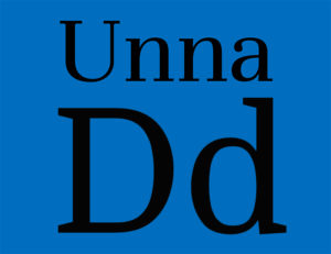
 There are times for bold statements, and times to back it off a bit. This week we offer two fonts that can do just that.
First, please meet Unna by Omnibus-Type. It’s a kindly font, designed by Jorge de Buen who named the font after his mother (awwww!). It features strong stems contrasting with delicate serifs for a softer, inviting style, and comes in two weights plus italics. De Buen created the font for book and editorial design, and it’s perfectly at home in both print and web. Download free from Behance.
Our second contender this week is Domine by Impallari Type. With open letters and short serif, the font’s friendly appearance is influenced by classic typefaces, but is more airy and contemporary. Available it two weights (so sorry, no italics), this would be right at home in body copy on the web, which is exactly what it was designed for. Download free from Google Fonts.
While we’re being so friendly, take a second and sign up for our newsletter. We’ll bring you new free fonts – and lots of useful industry news – every week. And be sure to show the font designers some love!
