 Macaroni and cheese; peanut butter and jelly; League Spartan and Libre Baskerville? Some things are just destined to be classic combinations.
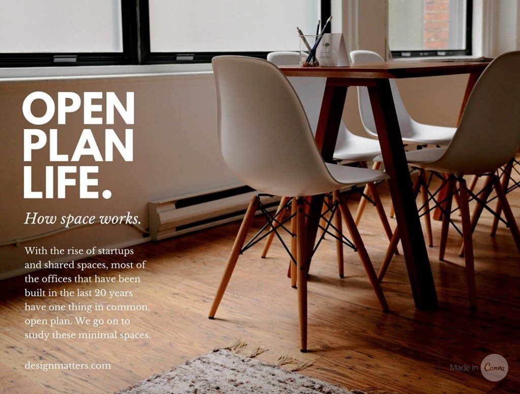
In print or digital design, one of the greatest challenges for designers is choosing the fonts for the piece. It requires an understanding of basic type anatomy, as well as a keen eye to composition and the emotive quality of the typeface.
Choosing the right font is far from hit or miss, as Poppie Pack explains in the Design School blog.
“There’s a science to applying a heading, subheading and body copy to suit the type of content you’re producing and the message or tone of your brand,” she writes.
She begins with one of the clearest and most concise explanations of type anatomy we’ve seen in a long time, and throws in an infographic glossary of terms all designers need to know when it’s time to work with type.
Finally, she serves up a list of 30 terrific font pairings, showing them in real world design situations and providing an explanation of how and why they work.
For example, for resumes she suggests Julius Sans and Archivo Narrow, saying “Julius Sans One offers a fine stroke, and its broader baseline makes it a great display font. Offsetting well against the more masculine and geometric style of Archivo Narrow, these typefaces offer a good combination for easy readability.”
If you’re going for a high-impact journalism look, Pack suggests Open Sans Extra Bold and Cooper Hewitt. “This combination has similarities to pairings you would find in newspapers or publishing. Open Sans Extra Bold grabs the attention of your audience, much like that of a headline.”
Her suggestion for magazines is spot on. “Source Sans Pro and Source Serif Pro were created to be used as a pair in design and are another excellent example of typographic harmony,” she writes. “Using a grid is one of the easiest ways to form a clean, structured composition, which creates balance and hierarchy, and color enhances these features by pulling tones in from the images to form consistency and visual harmony.”
Take a read through and send the article to your favorite designer, or bookmark this one for future reference. There’s a lot of good, usable material here.