 All caps has gotten a bad rap as rude or in your face. But let’s face it; sometimes you need to GET THEIR ATTENTION in the design world. And that’s when an all-caps titles font can be just the thing.
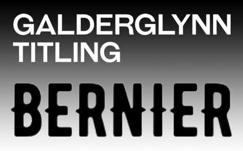
Take Galderglynn Titling by Typodermic Fonts, for example. Inspired by 19th-century metal type, it comes in seven weights plus italics. It’s terrific for prominent headlines and titles, as the name suggests. Download all seven weights free from Fontspring. (And if you’re looking for coordinating lowercase, you can purchase Galderglynn Esquire.)
Our second all-caps font this week is Bernier by Ryan Pyae, an art director in Myanmar. Bernier features three style options – Regular, Shade and Distressed. It’s great for trying the modern-vintage style trend, created a satisfying stamped or printed effect. Find it at FontM.
As always, please support the designers and font foundries that offer these great free fonts. And come back to us for another Free Font Friday, or sign up for our newsletter so you don’t miss a week.