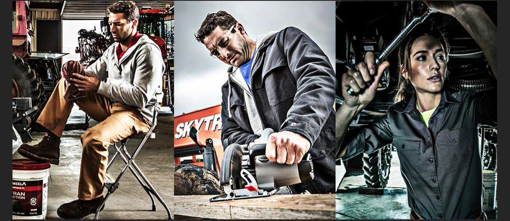
Print has this incredible ability to convey important information about your brand – far beyond the mere act of putting ink on paper. Done right, a reader should get a gut reaction, an emotional affinity, for what your brand is all about. As a great example, let’s look at the new WorkWear Outfitters catalog from Land’s End.
Catalogs are experiencing a renaissance; they are smarter and better looking than ever and are being used in ways far beyond the typical sales tool. They are increasingly being used to tell the brand story in a very real and tangible way. Land’s End apparently understands this.
The catalog’s tagline is “clothing that works as hard as you do,” and their design and print specs were carefully chosen to support that idea.
Ashley Roberts of Printing Impressions provides an insightful video review of the catalog; she spoke to Land’s End PR Manager Jenni Cotes to unpack the somewhat unusual printing choices. Three things, in particular, stand out: the paper, the size, and the imagery.
Cotes explained that choosing to print on a sturdy matte substrate “supports the aesthetic of the WorkWear imagery.” It’s substantial, rugged and no-nonsense. And, since this catalog is a limited print edition, it had to be durable so it would last.
The larger size – quite a bit larger than the usual Land’s End catalog – was also an intentional design element. As Cotes explained to Roberts, “they wanted to draw attention to the collection, since it’s a new line for the company.” She also explained that the type of paper and size of the catalog reflect the brand’s image of “being tough.”
Perhaps the most compelling element from a design perspective is the use of real world workers – not fashion models – in bold, highly stylized imagery throughout the catalog.
“To [the people who receive the catalog], work wear isn’t just apparel,” Roberts explains. “It’s a tool when they’re on the job.” To drive this point home, the models used are real Land’s End staffers, employed in the workshops and maintenance areas of the company. They are real people, doing real jobs, in clothing designed to support them. It’s a great touch and brings a huge dose of authenticity to the overall piece.
Color and font choices continue the “hard working” mindset of the catalog, forming a bold and compelling brand experience for the WorkWear line.
Land’s End has done a great job of utilizing one of print’s super powers – engaging the senses for an emotional connection. This strategy has been shown to improve print’s effectiveness by 70%, and Land’s End is making great use of this sensory experience.
“Textures, colors and imagery are a great way to align your direct mail with your brand,” Roberts reminds us. Land’s End just nailed it.
