 Living in the age of speed-of-light technical progress, it’s hard to remember when innovation and change was slower … much slower. Yet businesses faced some of the same challenges we do now when they fail to adapt quickly enough, and are overtaken by their competition.
So it was with type foundry Nebiolo, who found itself staring down the maw of big changes in publishing technology in the Sixties.
“In the early 1960s, with rapid changes caused by the advancing technologies of photocomposition and offset printing, despite state assistance, Nebiolo found itself in serious financial trouble,” writes Alessandro Colizzi in Medium.
“The type foundry’s production was only available for handsetting and the company’s weak position on the market derived from its dependence on sales to a few thousand Italian jobbing printers. Exports were not thriving either,” he notes.
To stop the foundry’s downward spiral, in 1965 they pulled together a research committee of graphic designers, all prominent names in the Milan design scene. For the next several years, they undertook the challenge of creating a universal typeface that – they hoped — would usher in the new design age of the ‘60s and ‘70s.
“As its name implied, Forma aimed at representing the ideal letterform of its time, as neutral and self-effacing as possible, suited for continuous text as well as titling, potentially appealing to graphic designers, advertising art directors, and printers alike,” Colizzi writes.
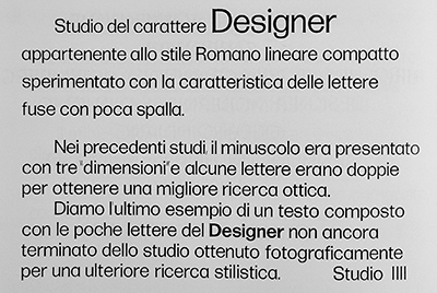
The article gives a fascinating account of the personalities and professional friction amongst team members, and the maddeningly slow progress they made slogging toward their solution. They created, then discarded as inadequate, a font called Designer. Finally settling on another typeface called Forma, they began testing the market – and things initially looked positive.
“The new typeface won a special mention at ADI’s (Associazione per il Disegno Industriale, Industrial Design Association) annual Compasso d’oro award in 1970 — the first time a type design had been awarded such an honour,” Colizzi explains.
While initial sales were encouraging, Forma “could not really compete in a market already saturated by competitor typefaces which were available for all the main composing systems.”
“With hindsight, the positions of the Milanese designers betray the intrinsic dogmatism typical of the modernist movement, in that their proposed solutions followed ideological rather than functional considerations,” Colizzi notes.
The eternal design question – form versus function – met head-on with disparate design sensibilities and prima donna-sized egos to derail the quest for a universally-accepted font.
Forma has been re-released to coincide with the love of everything mid-century, and is experiencing a bit of a renaissance. The story of its creation – and the ultimate demise of the Nebiolo foundry in the late ‘70s — reads like a cautionary tale on how not to collaborate on a potentially groundbreaking design project.