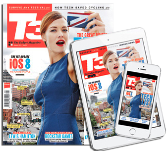
 Want to improve your game in publication layout? This article from Luke O’Neill offers 10 suggestions that will help you build up your editorial design skills.
The first, and probably the most important, is to identify your audience and design for them. Seems like a no-brainer, but it’s amazing how many designers do not thoroughly understand who they are designing for.
“This is the most important rule really, whether you’re launching a new publication or moving into a design role at an existing title, it’s imperative that you know your audience and design for them accordingly,” says O’Neill.
“In the same way that the reader must be able to identify with the tone of voice of the publication, the design must also speak to them, whether that be in an overt way or on a more subtle subconscious level,” he continues.
O’Neill then recommends that you work on the cover first.
“The cover needs to work on a number of levels — it must be unique enough to attract attention on a crowded newsstand whilst at the same time not alienating existing readers. It must spark curiosity and intrigue and tell a story selling the contents of the title to the onlooker,” says O’Neill.
Other recommendations include understanding and using the grid approach to design, and formulating a solid typographic hierarchy for your title. And while white space and pacing may vary from platform to platform, design with an understanding that your content may be read in multiple formats and should be truly cross-platform in appeal.
And of course, be creative and unique.
“Lastly and perhaps most importantly, be unique in both your ideas and design application. In a period of what seems like constant flux in the publishing industry, it’s never been more important to stand out from the crowd,” says O’Neill, noting the never-ending stream of new and beautifully designed titles on the market today.
Take these rules to heart and you’ll be invaluable to your clients and a huge asset on any publishing team.
