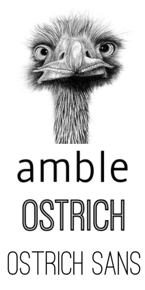
 Inline fonts – typefaces that contain a narrow stroke inside the thicker font body – have been around for centuries in print. Lately they’ve become really popular for online design too, especially in flat design situations.
I think almost everyone can agree that inline fonts are super fun. But a lot of people would also agree that they can get old FAST. That’s why I like to pair Ostrich Sans Inline with regular Ostrich Sans and have them work together as an amazing display font team. They are both part of the full Ostrich Family (10 styles in all) by Tyler Finck.
Use some of the other font styles available to create header tiers that make the piece more visually interesting, without overwhelming. Join forces with a modern san serif body copy font like Amble, and start designing. I used the light condensed version of Amble because I personally think it pairs the best with the condensed style of Ostrich Sans. Amble comes in eight styles, from the Punchcut foundry.
Stay tuned for more free fonts each Friday, and as always, show those font designers some love.
