 Slab fonts– with their thick, block-like serifs – generally impart a certainly solidity and confidence. Yet not all slabs have the same gravitas, and sometimes it’s easy to overlook the subtle, but important, differences.
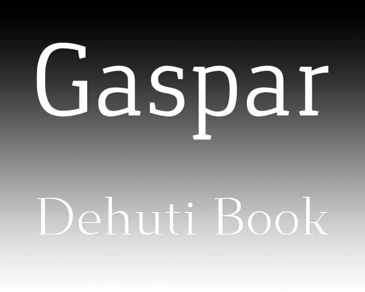
Take Gaspar, for example, a contemporary slab serif from Carlos Alonso. It features a modern, lightly oblique slab serif, and comes in regular, italic, bold and bold italic. In terms of heft, it’s a rather classic slab weight, yet its interesting lines keep it from getting too heavy. It’s great for multipurpose typesetting for print and web. Download for free at Font Squirrel.
On the other end of the slab spectrum is Dehuti by T. Christopher White. What makes this slab different is the delicacy of the serifs. Still technically a slab font, it manages to lighten up quite a bit without losing its form. The elegant design comes in two weights plus one italic style, and includes a nice set of alternate characters. It’s perfect for designs that call for a traditional or conservative style, especially in long passages of text where the weight of a heavier slab would bog things down. Find it at Font Squirrel.
So much of font design is in the tiniest of details, so we hope you like our picks this week. As always, share the love with the designers who bring you these great fonts. And be sure to come back for our next Free Font Friday.