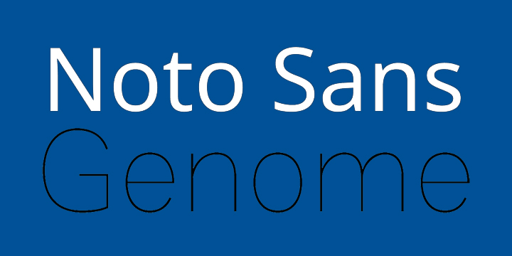
 It’s time to make “tofu” obsolete. And we don’t mean the kind you might have in your fridge.
“When text is rendered by a computer, sometimes there will be characters in the text that can not be displayed because no font that supports them is available to the computer,” notes this post in FontSquirrel. “When this occurs, small boxes are shown to represent the characters. We call those small boxes ‘tofu,’ and we want to remove tofu from the Web.”
According to Google, which designed the font, the Noto font family “aims to support all languages with a harmonious look and feel. Noto is Google’s answer to tofu. The name noto is to convey the idea that Google’s goal is to see ‘no more tofu’.”
You can download Noto Sans, a highly readable design created for the web with multiple language support in two weights plus italics, from FontSquirrel. It’s great for websites and apps, and offers excellent readability.
Another good choice for onscreen applications is Genome by Alfredo Marco Pradil. Its clean, lightweight design was created with the right proportions to facilitate easy readability on screen in certain sizes. It’s a good choice for web design at larger sizes, although its thin letters might be hard to see at smaller point sizes. Find it at Behance.
Please remember to appreciate the font designs and the platforms that bring us all these great free fonts. Like, share, or make a donation if you really love what you see. And come back next week for more Free Font Fridays.
