 Traditionalists vs. modernists exist in just about every aspect of our culture. Their preferences and beliefs shape their work, their creativity and their careers, often with polarizing effect. This is evident in the world of font design, as this article in PRINT explains.
“Type traditionalists would have it that typefaces from throughout the history of type be maintained for use by designers,” the article notes. “It is through this continuity that we keep certain cultural and historical threads intact, and give ourselves the opportunity to learn from and honor the wisdom and ingenuity of typefounders and punchcutters from earlier ages. Technology, a traditionalist would have it, should keep up with the best ways of realizing and perpetuating a typographical continuum, giving designers access to history’s best typefaces.
“Type modernists, on the other hand, look at the issue differently,” the article continues. “In the view of the modernists, types of the past are of and for their time, not just stylistically, but technologically. Updating older typefaces would be an exercise in nostalgia; each new era requires its own unique typefaces.”
Sounds like a fairly firm divide … but what if there really is a middle ground? The current thinking on type revivals might be just that commonplace, forcing type designers and users to ask the important questions:
“Should a typeface be revived because it solves a current problem?”
“How faithful need the revival type be to the original?”
“How do we anticipate and adjust to changes in technology and taste?”
“What if the definition of type revival was broadened, encouraging graphic designers to think more expansively and more deeply about revivals?”
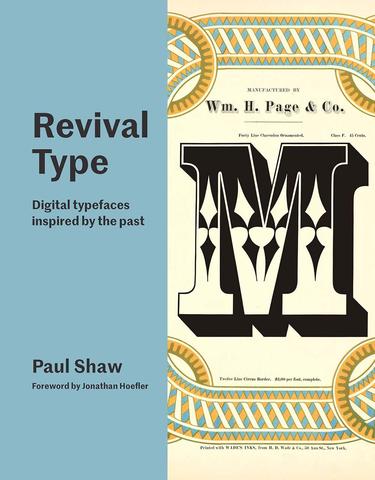
Designer and design historian Paul Shaw attempts to do exactly this in his new book Revival Type: Digital Typefaces Inspired by the Past from Yale University Press. Shaw looks at the iconic, the classic and the downright weird fonts that are undergoing revival for the digital age.
“Many typefaces from the pre-digital past have been reinvented for use on computers and mobile devices, while other new font designs are revivals of letterforms, drawn from inscriptions, calligraphic manuals, posters, and book jackets. Revival Type deftly introduces these fonts, many of which are widely used, and engagingly tells their stories,” notes the promo copy from Yale Books.
It looks like a fantastic book, offering an interesting look at how fonts are faring in the move from traditional print to digital applications. Any design geek would love this one . . . and it will probably be on our Freeport bookshelves soon.
Now for a slightly off-topic tip of the hat — around here, we’ve been known to rant about the misuse of sponsored content and the potential impact on reader trust. We’ve even been known poke fun at the irony of it all. But in this case, we kind of like what PRINT did here, introducing this sponsored content clearly and upfront, in a way that opens the door to reader trust. Nice work.
