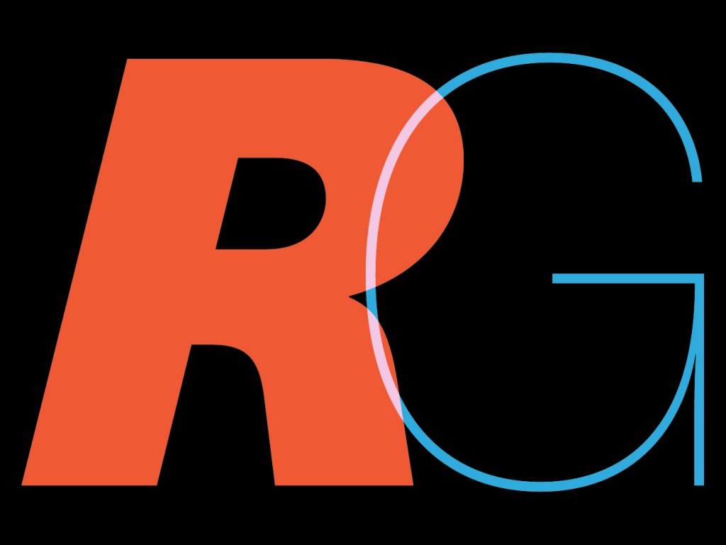
It was a perfect example of the right thing at the wrong time.
Back in the ‘70s the Swiss type foundry that created Helvetica set about making a follow-up font that would translate to phototypesetting and fix some of Helvetica’s flaws.
A design team at Hass did just that, creating Unica. Then, the world happened.
“By the time they finished Unica, however, Haas was going out of business. Further, the typographic world was on the verge of being rocked by another new technology: desktop publishing,” writes Kyle Vanhemert in Wired.
“The advent of personal computers, particularly the Macintosh, would make it possible to experiment with type in tremendous new ways. Phototypesetting, for which Unica had been designed, was quickly losing relevance. As a result, Unica got lost in the shuffle,” Vanhemert notes.
“In the years that followed, Unica slipped into obscurity, accumulating a sort of mythology along the way. It had been digitized in the 1980s by another company—that also promptly folded,” Vanhemert continues.
“Because it was released by companies who went out of business, there was kind of murkiness for a while about whether or not people could do anything with Unica, which I think added to its legend,” said Dan Rhatigan of Monotype, the company that now owns the name and the rights, plus the original tracings of the font.
Rhatigan immediately saw the appeal of using Unica on digital applications, and undertook a campaign to re-introduce the font, updated of course to modern technology. The font is enjoying a modern renaissance, and even after all these years, it still looks very, very good.
Take a look and see why this has us itching to design something. Might be a good way to spend a Friday afternoon.
