There’s an interesting paradox in the world today; while blindness is decreasing globally, longer lifespans mean people are now living long enough to gradually lose their vision, accordion to Callie Budrick in PrintMag.
“So what does that mean for printed materials—and how can designers create fonts that are easily read by the growing population of low-vision consumers?” Budrick asks.
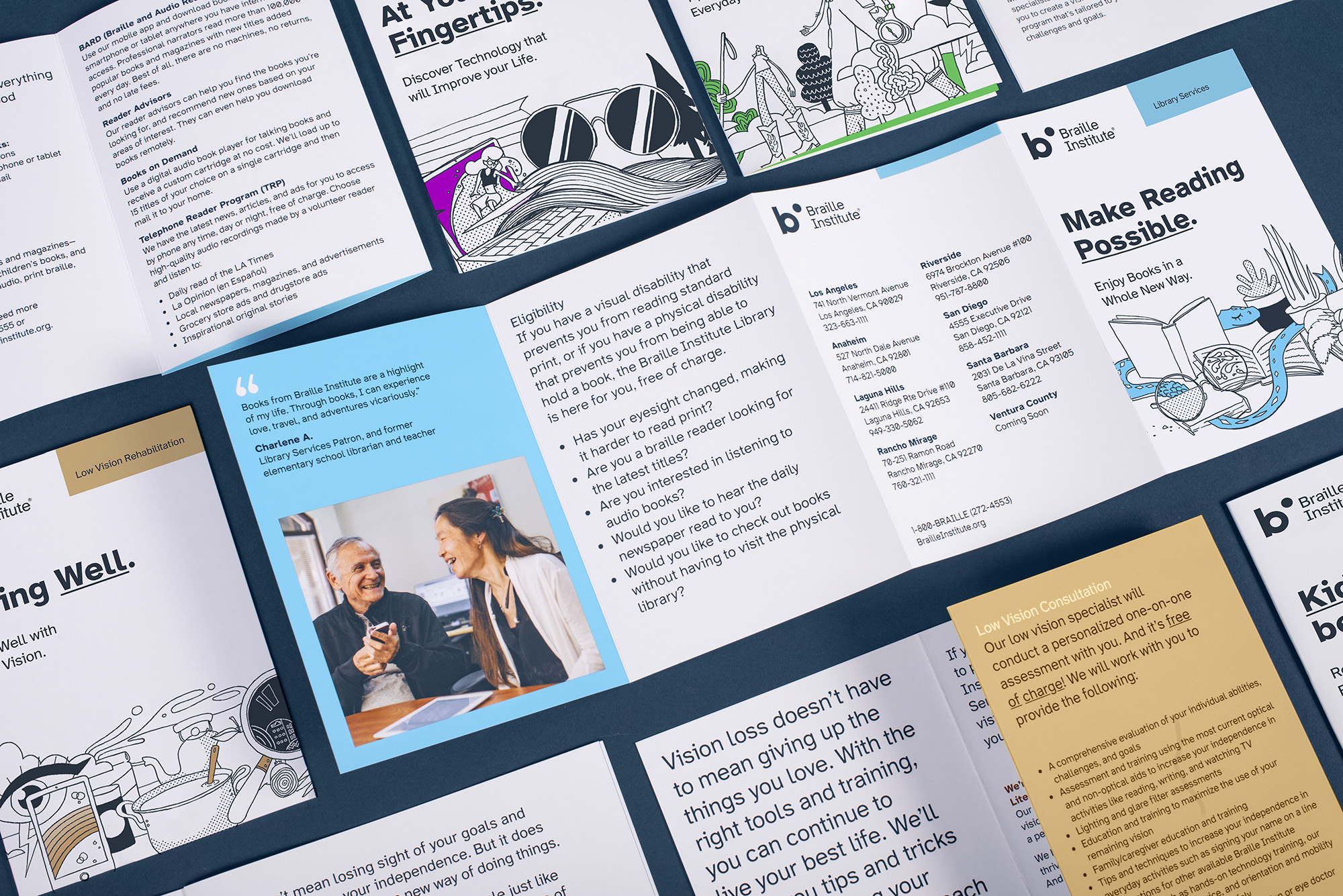
Enter Atkinson Hyperlegible, a font created specifically to improve legibility without magnification. It was designed by Applied Design Works in NYC in partnership with the Braille Institute.
“For low-vision readers, certain letters and numbers can be hard to distinguish from one another,” notes the Braille Institute’s website. “Atkinson Hyperlegible differentiates common misinterpreted letters and numbers using various design techniques.”
The result? A more easily recognizable form and footprint for readers.
The traditional grotesque sans serif font is free to download and comes in two weights, with 1,340 glyphs and support for 27 languages. Download Atkinson Hyperlegible today.
Enjoy this very special font for Free Font Friday, and we’ll see you again next week!
