Still guessing and hoping? Try this approach for finding just the right type for your next project or branding assignment.
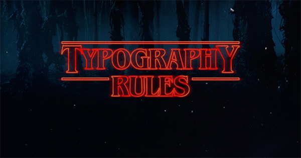 Typography – it’s a crucial element to all good design. And it’s also a challenge for many of us to get right. Some designers just seem to have a sixth sense about font selections. For many of us, though, we struggle a bit (or a lot). So we tend to rely on a few tried-and-true font pairings that, while they may fit the bill, don’t make our designs shine with that certain something.
Thanks to Jonathan Z. White in Medium’s Free Code Camp, we’ve now got a 5-step process for choosing type that will elevate your game.
“One of the most important skills you can learn as a designer is how to choose type,” White writes. “This is because text is one of the primary ways designers can communicate with users. Typography can make or break a design.”
“This article is designed to serve as a starting point for helping you learn how to choose type for your designs. It will encourage you to explore fonts and font combinations beyond those you’re familiar with,” he continues.
White boils it down to these five points:
- Identify your purpose. “Good design aligns its typography with its purpose. This is because typography is key to setting mood, tone, and style in your designs,” he notes. For example, if you’re designing an image-rich landing page, choose a simplified font that communicates the information needed without competing with the graphics.
- Identify your audience. White says this step is crucial “because information about your users such as age, interests, and cultural upbringing could influence the decisions you make for your type.” If you’re designing for seniors, for instance, think readability and contrast; avoid scripts and highly-decorative styles. “Simply put, empathize with your users,” White notes.
- Look for inspiration. Now that you’ve identified your purpose and your audience, look for some inspiration. Check out our collection of Free Friday Fonts, or The 100 Best Free Fonts from CreativeBloq. Don’t get sidetracked by personal preferences; keep your purpose and your audience front and center.
- Choose your fonts. White says it’s important at this stage to keep three things firmly in mind: readability, legibility and purpose. When considering a font, research its intended purpose (most fonts come with some explanation from the creator), and look at examples of the font in use.
- Great a typography style guide. “The last step of the process is to create a style guide for your typography to help standardize type across your designs,” White explains. (He recommends Sketch to help create and share type styles.) “In your style guide, make sure to at least include the following things: font definitions, font sizes, font colors, and example usages.”
The entire article is a great read and full of good info. Typography is part art and part science, as White notes. Will these five steps make you a world-class font chooser? Maybe not, but at the very least you’ll be way ahead from the “hope and pray” method.