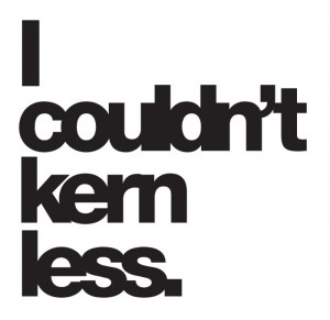
 How to fix it when the type just looks off; 9 pro tips you need to know.
It’s Friday, a good day for a little design lesson and maybe some audio from The Byrds.
“Have you ever looked at a word or phrase you’re typesetting and something just looked off about it?” asks Janie Kliever in Design School.
She notes that it could be a kerning problem, “the amount of space between two letters (or other characters: numbers, punctuation, etc.) and the process of adjusting that space to avoid awkward-looking gaps between your letters and improve legibility.”
Understanding kerning and how to manipulate it is a crucial design skill, and one that can set you apart as someone who knows your stuff.
Kliever makes an excellent case for why you need to have a strong kerning game in your design skill set. And she offers nine pro tips to learn and use to keep the type flowing:
- Watch out for certain letter combinations
- Understand the relationship between space and letter shape
- Be aware of point size
- Err on the side of over-kerning
- Flip it (our favorite – it’s genius)
- Save kerning ‘til last
- Know when
- Put it into practice
- Don’t forget web content
For any designer, this tutorial offers a great intro to the idea of kerning and why it’s so critical to polished design. So put on some music and kern…kern…kern!
