 It’s the universal lingua franca of color. Here’s how it got there.
“Unless you work in design, chances are your first encounter with the mythic New Jersey-based color standards company was via a color-coded mug, iPhone case or in a Sephora makeup counter,” writes Anne Quito in Quartz. “In recent years, the design of Pantone’s color chips have become a graphic trope: always a plain band of color with a white bar and some words and black numbers in Helvetica on the bottom.”
“This chip design is strictly technical, lifted from the layout of a tool used by designers to specify and standardize color when communicating with printers and fabric dyers. So how did it find its way onto mugs, home goods, hospital scrubs, nail polish and even boxer briefs?” Quito asks.
The answer is part color history and part pop culture study.
“The Pantone chip itself began appearing on objects after the company published a series of ads during New York Fashion Week,” Quito explains, referring to the campaign that put Pantone chips on designers’ noses and plastered the images around the city.
The brand has expanded into the Pantone Universe, a licensing programming that allows other companies to use the name and design in such diverse venues as a pop-up Pantone café in Monaco and a boutique hotel in Brussels.
There’s even a line of hospital scrubs. Some facilities use them to help patients in long-term care know what day of the week it is based on the color the staff is wearing.
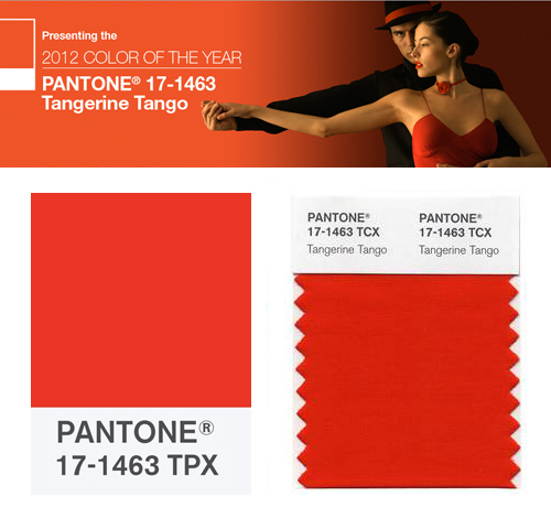
“In the same way that Kodak became synonymous with photography in the 1900s, Pantone’s brand—propagated through its thousands of licensed and unlicensed guises and coupled with the company’s own vibrant marketing programs (like Pantone Color of the Year)—has become global shorthand for the infinite variety and importance of color in the human experience,” Quito notes.
Beloved by designers, Imitated, made into memes and parodied by the rest of us, the brand has become a legitimate icon of the 21st century. It’s worth a read.
