 “Some time ago I read an article by the excellent Indra Kupferschmid with a title that drew a bold parallel between Novarese and Ferrari, when the digital version of Forma was launched,” writes Luciana Perondi in Foundry’s blog.
“For those who don’t know her, Indra is to typography what Michèle Mouton is to rally driving, but if we want to explore the somewhat far-fetched comparison of that headline (possibly not the invention of the author herself but of some unbridled subeditor), we should give the whole conceit some careful thought,” Perondi continues. “Because the only real thing Novarese and Ferrari have in common is their nationality, and to compare the two does justice to neither.”
Perondi goes into great detail to explain why – making points that cover the gamut from commercial appeal to technical quality and cultural significance. Along the way, he provides some amusing, intriguing and far-flung information on the history of Italian type design…and automobiles.
For fellow font geeks, you’ll probably have some big lightbulb moments reading it, or at least have an “aha” moment or two.
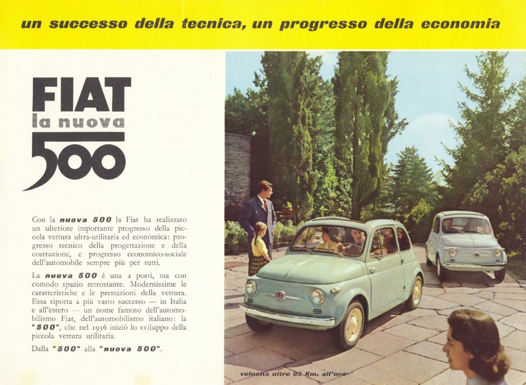
Take Perondi’s comparison between Fiat’s Dante Giacosa and type creator Francesco Simoncini. As Perondi explains, they “… were both engineers rather than designers. Both knew how to use their technical know-how and intuition to produce a solid, essential product perfectly appropriate to the context. And in the end with significant results, not least from the visual angle, both almost ‘cute’.”
“The Fiat 500 is the car that got Italy on the road; Simoncini Garamond is the typeface of the Italian publishing industry, the one that has shaped it, for better or worse, over the last fifty years. And last but not least, they were both issued in the same year, 1957,” Perondi continues.
The article is full of similar references and intriguing insights, all carefully crafted and supported. It’s an intriguing way to look at design and how it relates to the larger social context. And it’s a really fun read.
