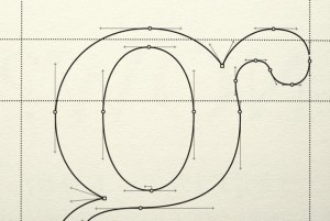
 An acclaimed writer explains why he now types all his manuscripts in the 250-year-old typeface.
“In 2013, acclaimed filmmaker and author Errol Morris ran a bold experiment. With the collusion of the New York Times, he asked 45,000 readers to take an online test. The test allegedly measured whether or not readers were optimists or pessimists,” writes John Brownlee in FastCoDesign. “But in reality, Morris was trying to find out if the typeface a statement was written in had any impact on a reader’s willingness to agree with that statement. Simply put, are some typefaces more believable than others?”
“The answer is yes. Baskerville, a 250-year-old serif originally designed by John Baskerville, was statistically more likely to influence the minds of readers than Computer Modern, Georgia, Helvetica, Comic Sans or Trebuchet,” Brownlee continues.
According to Brownlee, Morris has been fascinated by the “truthiness” of certain typefaces for years, since reading Naming and Necessity by Saul Kripke. He admits he was somewhat disturbed by the notion that a font could edge us into believing or disbelieving something.
The results of the startling experiment were originally published online, and then recreated in print as a Pentagram Paper, which Morris calls “beautiful.”
“It’s full of amazing details. It has marbled end papers, which I’ve just never seen done in a paperback before. And, of course, the typography is just wonderful: it’s a book about Baskerville, printed in Baskerville, that looks like it could have been published by John Baskerville, during his life.”
Graphic designers understand the power of the right typeface to convey their message. Now thanks to Morris we have some statistical proof of the concept. It’s definitely worth exploring in greater depth and we hope to hear more about this kind of research.
