 Sugar sand beaches, palm trees with the requisite hammock swinging between them, adorable fruit drinks served under a tiki-thatched swim-up bar – a lot of travel journalism leaves us longing for something more, something we haven’t seen before.
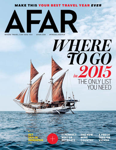
Fortunately for those of us with serious wanderlust, Afar magazine has a new look and feel, thanks in large part to the work of former Bon Appetit creative staffer Elizabeth Spiridakis Olson.
“If most travel magazines are like a tired ‘Wish You Were Here’ postcard, the new Afar is like ripping a bespoke, hand-lettered sign off of some exotic city wall, then bringing it back in your luggage. It’s not just typographically beautiful, but it has a life of its own,” writes John Brownlee in Fast Co’s Design blog.
He’s right.
Brownlee writes that Olson had “a lot of problems with the old version” of the magazine, which she claims lacked the ability to showcase the photography and stories in the right way.
“The biggest pet peeve Olson had about the old Afar revolved around the typography, which lacked imagination. Olson’s redesign ups Afar’s cred amongst type lovers with a blend of bold new digital fonts and tactile, hand-drawn lettering,” Brownlee notes.
The typeface draws us in, but what keeps us there is the content. It’s just…different…from the usual brochure-style travel content we all too often see. And that’s exactly Olson’s point.
“When Olson came onboard, she and the magazine’s photography editor re-dedicated the magazine to the idea that even destinations as well-trodden as Tokyo, Rome, and Paris can feel unexpected, as long as you aren’t afraid to come from it from a starkly different angle,” Brownlee explains.
The changes make a huge difference. The magazine is up for several design awards and the public is eating it up with current sales outselling last year’s on the newsstands. This is one good looking travel magazine.