 Can a typeface have split personalities? Any good font geek will tell you they sure can. But it’s not always obvious on first glance.
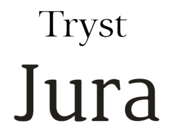
Take Tryst, a transitional, highly readable serif font designed by Philatype. The way it’s been designed makes it highly adaptable for headings, subheadings and body copy. The magic comes in when you start to play around with kerning and line heights – that’s when Tryst really shines. See examples and download it from Behance.
Jura, on the other hand, looks less “traditional,” with its wedge-shaped serifs that give it a decidedly eclectic feel. Designed by Daniel Johnson, this hand-crafted pixel based font is available in regular, italic, bold and bold italic. Download it at Ten by Twenty.
(If you’re new here, Free Font Fridays are a thing. Sign up for our newsletter for more.)