 Pantone’s annual color has been announced…and there’s a wrinkle this year.
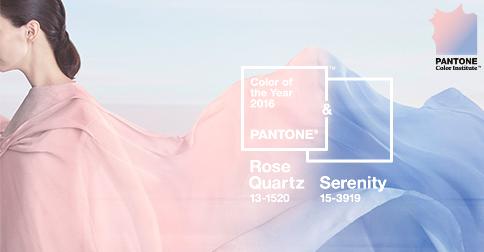
Pink and blue.
To the uninitiated, that’s the reaction to Pantone’s annual color of the year choice. To the design set, they are better known as Rose Quartz 13-1520 and Serenity 15-3919. And yes, this year is something of a first.
Every year since 2000, Pantone has chosen one shade as their Color of the Year.
“And in 2016, for the first time, two hues — the periwinkle Serenity and the pink Rose Quartz — share the Color of the Year crown,” writes Adrianne Pasquarelli in AdAge.
“The complexity of the logic behind Color of the Year is greater than interior design or fashion — it’s a forecast, a reflection of what’s happening in the world,” explained Ron Potesky, senior VP and general manager at Pantone. “These colors were seen together almost like two sides of a coin — they were showing up in many different places together.”
Pasquarelli goes on to explain the significance of the choice.
“These days, the 20-person Pantone Color Institute begins its global research and reflection in the spring and spends the ensuing months choosing the winning hue,” she writes. “They look for common threads in street art, at trade shows and on catwalks. This year’s pastel shades were chosen for their calming effect in an age of technological overstimulation.”
We could all use a little calm vs. technological overstimulation. So congrats, Rose Quartz and Serenity…2016 is gonna be your year.