Is it ever okay to alter a designer’s typography? According to some, the sliced text trend is one instance where it’s perfectly okay.
“The nifty effect makes type elements look like they’ve been cut with a precision tool and can add visual interest to logotypes, headlines and simple text blocks,” writes Carrie Cousins in Design Shack. “Sliced text effects can vary from super subtle (such as a small bit of a letter that’s missing) to major parts of words missing altogether.”
She warns that, when using this trendy type treatment, be sure your end result is readable, “and you should pay close attention so that unintended letter combinations or words don’t appear due to slicing.”
There are a few different techniques to slicing text – traditional overlay, slicing images, sliced overlays, vertical slices, etc. – but there are some key elements to keep in mind no matter how you slice it.
“Pay attention to the way slicing creates white space,” Cousins advises. “The design above uses a wide slice of additional information inside it. The more common usage of slicing is often a thin line, but approaches (as you can see from the examples in this post) can vary pretty dramatically.”
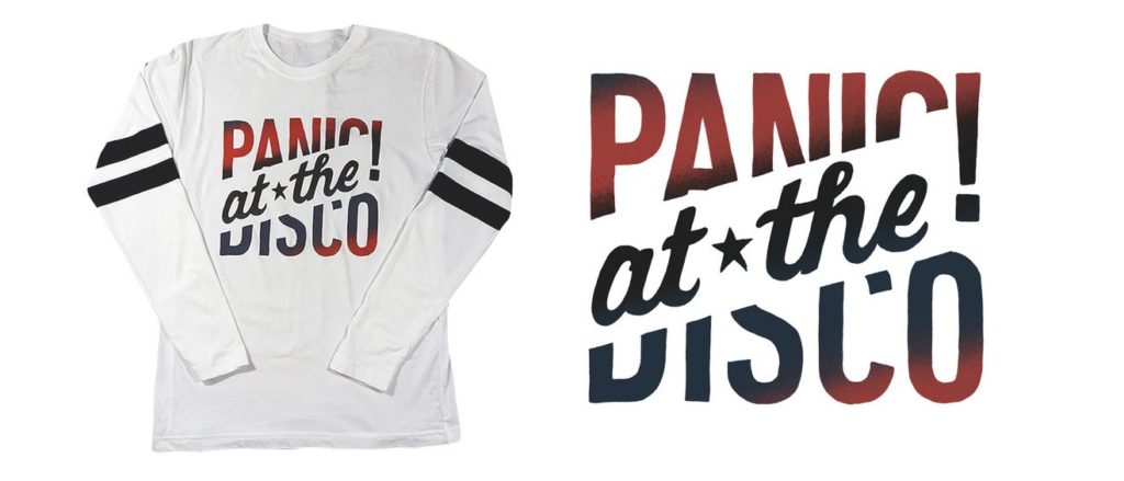
The sliced text can add emphasis, create visual flow, and make your design more compelling. But care should be taken to get it right.
“Using the sliced text trend can be a little tricky because it does involve altering type elements. It’s important that readability is not lost or you could lose users with this effect.”
Her post offers links to some great resources to learn the tricks of this technique, including a video on slicing in Adobe Illustrator, and a primer on cutting text in CSS.
Used properly, this can definitely add some punch to your design; check out her post and her advice, and see what you can do!