Back in 2014, designer Ben Whitmore saw a problem.
“Of the hundreds of thousands of free fonts on the web, only a tiny handful are ‘text’ fonts suitable for plain text,” he explained in a blog post. “Some of these have bold and italic variants, perhaps even small capitals; but almost none offer different optical sizes. In fact, not a single freeware font exists with a rich set of glyphs, weights and optical sizes — until now.”
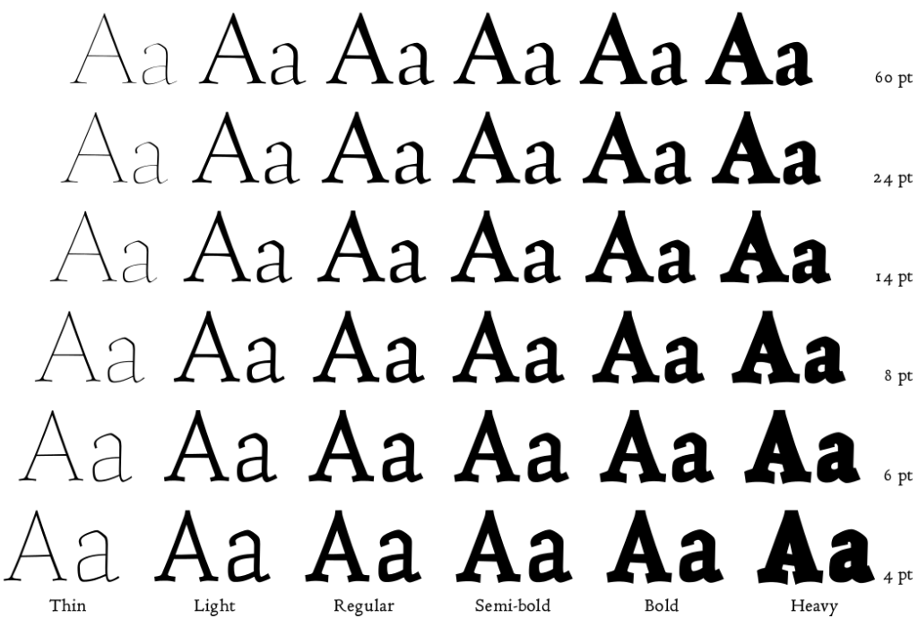 “Taking up the challenge, I have been creating Coelacanth, a typeface inspired by Bruce Rogers’ legendary Centaur, described by some as the most beautiful typeface ever designed. There are surprisingly few digital revivals of Centaur, and none that I know of providing the smaller optical sizes that were available in the original metal type. Centaur was tremendously versatile, as elegant and readable in the smallest caption text as it was at display sizes.”
According to Whitmore, the italics version is still underway, but you’ll want to grab the regular in all six weights. We think it’s great for books and other long-form text, as it maintains readability no matter the size. Find it at Altervista/Ben Whitmore.
Another necessity for web-based text is an anti-tofu weapon. Back by popular demand is Noto Serif and Noto Sans, created by Google Fonts. We offered them in the spring and they were pretty popular, so here’s your chance.
“When text is rendered by a computer, sometimes there will be characters in the text that cannot be displayed because no font that supports them is available to the computer,” notes this post in FontSquirrel. “When this occurs, small boxes are shown to represent the characters. We call those small boxes ‘tofu,’ and we want to remove tofu from the Web.”
According to Google, the Noto font family “aims to support all languages with a harmonious look and feel. Noto is Google’s answer to tofu. The name noto is to convey the idea that Google’s goal is to see ‘no more tofu’.”
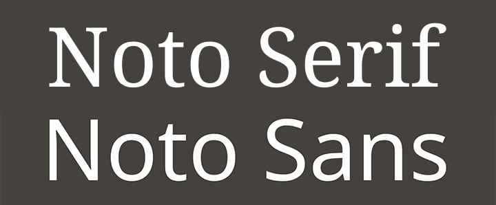
Both the serif and sans versions offer a highly readable design created for the web with multiple language support in two weights plus italic. It’s great for websites and apps, and offers excellent readability. Download Noto Serif and Noto Sans for free from the good people at FontSquirrel.
Enjoy these two picks and please come back for more Free Friday Fonts next week!