 We keep a pretty close eye on typefaces around here and usually report the good finds to our readers. So I was a little surprised that these gems snuck by us somehow.
“As we gear up for Print’s Typography & Lettering Awards, we’re once again taking stock of our favorite winners from last year’s competition, which was judged by Dana Tanamachi and Dr. Shelley Gruendler,” wrote Zachary Petit in Print Mag last fall. “For the latest type takeover, here are six eye-catching faces, from the workhorses to the colorful and curious.”
The choices range from the super-utilitarian (we can think of a ton of ways to use Monotype’s Neue Hass Unica) to the decidedly deconstructed (Typewood from NovoTypo is in a class unto itself).
By the way, we love the way Monotype’s site lets you try out types in real time on screen. It’s a nice touch, and we could spend an awful lot of time on there.
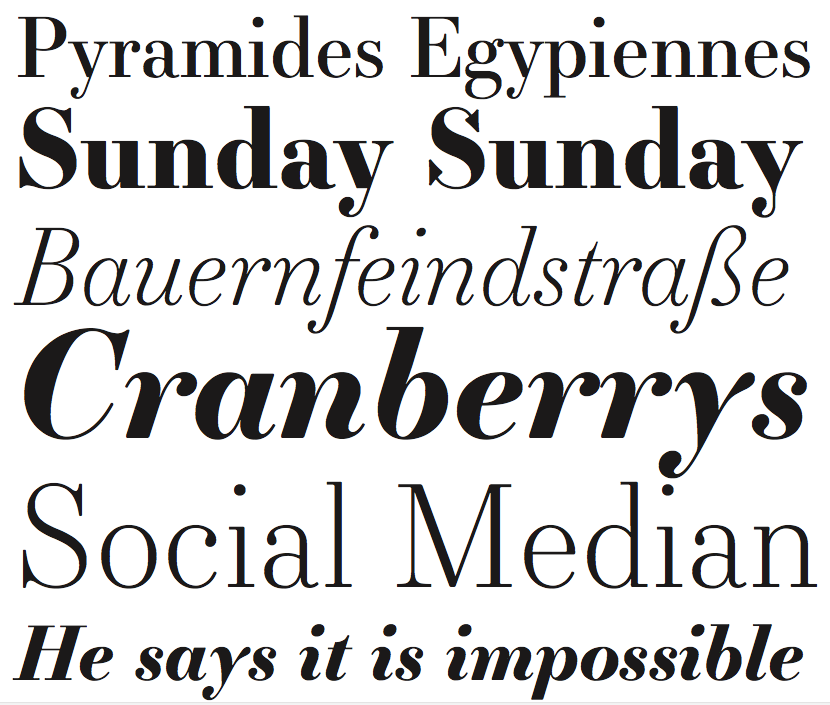
Our favorite is probably Essonnes (pictured) from the JTD foundry. They describe it as “a contemporary typeface inspired by history in three optical sizes.”
“Born of a union between Didot experimentation, late Victorian extravagance, and contemporary pragmatism, Essonnes is a type system which brings both the familiarity and creativity of a Didone together with the situational requirements of the 21st century,” the site continues.
Translated for the layperson, it means there is something decidedly familiar about it, yet a subtle freshness that we haven’t seen before. And it’s gorgeous.
Enjoy a look at all six winners and see what kind of creative urges they inspire.