It’s finally here!!! And no, I don’t mean Christmas …
The sights and sounds this time of year always lead to that one moment of bliss for design geeks and print fans everywhere. No, we aren’t talking about those presents under the tree. It’s time for Pantone’s Color the Year!
Last year, we all crooned and swooned to 2018’s color purple. Before that is was all about green in 2017, and an unusual choice of two colors for 2016. So what’s on our palettes for 2019?
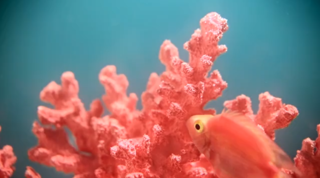
“Vibrant, yet mellow PANTONE 16-1546 Living Coral embraces us with warmth and nourishment to provide comfort and buoyancy in our continually shifting environment,” notes the official Color of the Year announcement from Pantone.
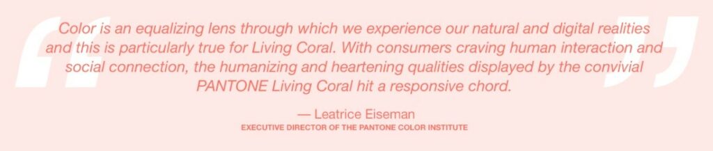
“In reaction to the onslaught of digital technology and social media increasingly embedding into daily life, we are seeking authentic and immersive experiences that enable connection and intimacy,” the announcement continues. “Sociable and spirited, the engaging nature of PANTONE 16-1546 Living Coral welcomes and encourages lighthearted activity. Symbolizing our innate need for optimism and joyful pursuits, PANTONE 16-1546 Living Coral embodies our desire for playful expression.”
What does this mean for designers? We’re bound to see this color influencing everything from fabrics to throw pillows to product packaging and design, Pantone explains.
I think we can all use a little more lightheartedness and real engagement in our days – and if this color can help bring that about, then I say get it by the gallon and throw it around.