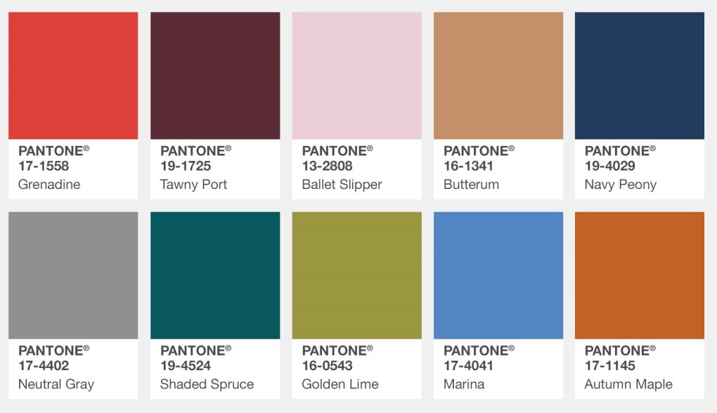
Care for a little Grenadine with your Tawny Port woolies? It’s that time of year when the Pantone Color Institute evaluates the colors on display from top designers during New York Fashion Week. According to Leatrice Eiseman of the Pantone Color Institute, “[t]his information is then used to create The PANTONE Fashion Color Report where we highlight the top 10 colors for men’s and women’s fashion for the upcoming season.”
“Bookended by a dynamic Grenadine red and a tawny Autumn Maple, the color palette for Fall 2017 leans more to warmth, “ says Eiseman. “While comforting, enveloping colors and ease are crucial to the seasonal feeling, standout shades include a pale pink Ballet Slipper, a refreshing Golden Lime, and a bright Marina blue. These hues add a striking touch when paired with the classic autumnal shades of Navy Peony, Neutral Gray, Butterrum and Tawny Port.”
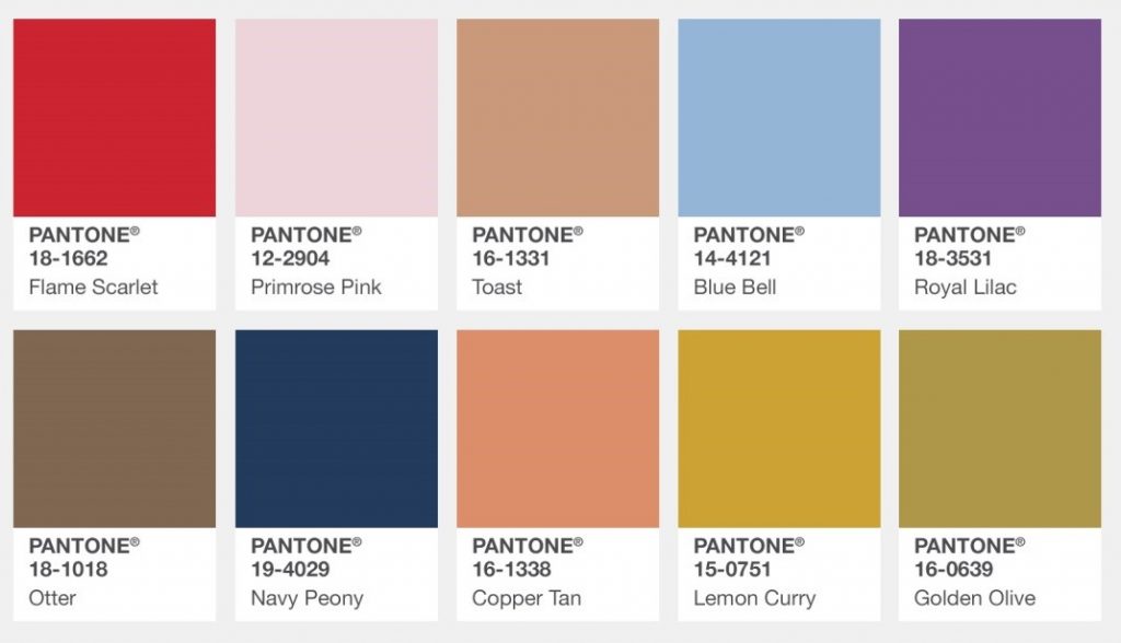
And across the pond, for the first time, Pantone has also analyzed London Fashion Week to see what our older cousins are donning this fall.
“Led by a vivid Flame Scarlet, the color palette for Autumn/Winter 2017/2018 is comprised of strong classics colors complemented by a few unpredictable shades for the autumn and winter seasons,” noted Eiseman. “Unexpected combinations such as Royal Lilac and Otter Brown or Lemon Curry with Bluebell are eye-arresting and create an unusual color dichotomy.”
I can smell the pumpkin spice latte now; maybe it’s time to shop for some new plaid.