 To each his own.
“Every design project is unique and requires a typeface that matches the visual aesthetics and compliments the content,” notes this post from Digital Synopsis. “However, there are some typefaces that designers try to steer clear of, because designers find them ugly, outdated or overused.”
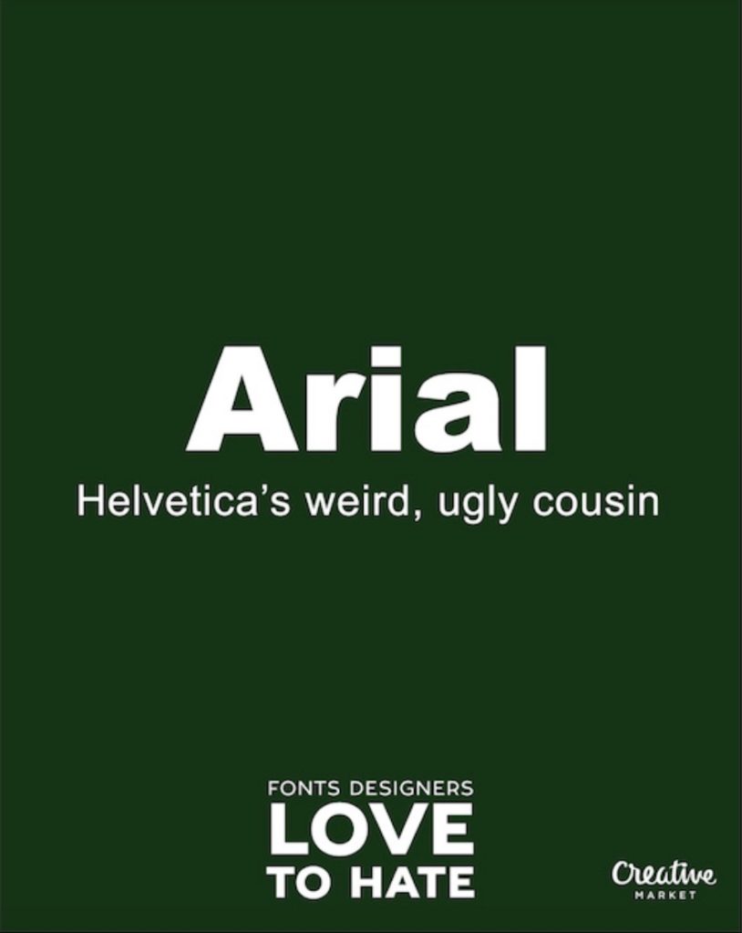
Driving the point home, Creative Market created a series of posters called “Fonts designers love to hate.” And it’s pretty hilarious.
Take Arial, for example, called “Helvetica’s weird, ugly cousin” by Creative Market. Or Trajan, “used on every movie poster, regardless of genre or time period.”
My favorite? Hobo, about which Creative Market says “The Dukes of Hazzard called, they want their font back.”
Ouch.
Need to dress up your office wall and make a subtle yet clear statement about your design standards? You might want to grab these posters and print them out in living color.
Meanwhile, check out some of our Free Friday Fonts. We can pretty much guarantee you won’t find any of these fonts there.