 Some of the most creative designs are born out of restrictions – of the medium, of space, of budget or other restraints. This week, we offer two typefaces to consider when your design is up against specific spacing challenges.
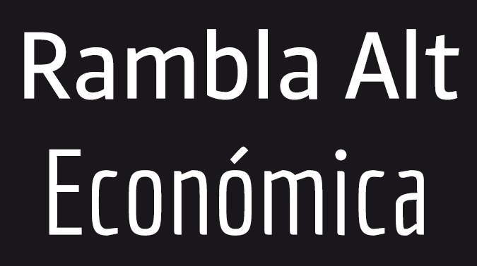
The first is Rambla Alt, a good choice when you need to save space in text. Designed by TipoType co-founder Martín Sommaruga from Uruguay, this slightly condensed, proportional sans-serif offers good readability in medium-long texts. The generous x-height and short ascenders and descenders give it a lot of rhythms while conserving line space. Download it at TipoType.
Another good choice where space is an issue is Economic, designed by TipoType’s other co-founder Vicente Lamónaca. The somewhat angular sans-serif design was developed to help save space and maintain legibility in complex typesetting situations; for example, when publishing texts. It maintains legibility even at very small sizes, making it ideal for newspapers and similar printing jobs. Download from TipoType.
Both of these fonts are free for commercial or personal use. So grab them for your toolbox, and do what you can to support the good folks to TipoType. And tune in next week for more Free Friday Fonts.