 Creating a new font is often a challenging journey, as Mathiew Triay writes in Creative Review.
“I recently finished working on Marvin Visions, a modern reinterpretation of the typeface Marvin that was originally designed in 1969 by Michael Chave and published by Face Photosetting,” he notes.
“There were a lot of hurdles to get there as resources are scarce,” he continues.
For one thing, many of the books and resources most font designers consider essential are difficult to acquire, either out of print or out of budget.
“If you’re lucky enough to have a type design workshop or university course near you, they’re not exactly affordable for the casual learner,” Triay continues. “So, where can one start to learn about type design?”
For him, the journey began by “learning to see,” not in the usual sense but through the eyes of a type designer.
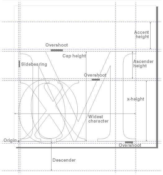
“Find some typefaces you like and look at individual letters. Then focus your attention on how letters relate to one another and how they assemble to make words,” he advises, offering detailed advice on how to evaluate typeface form and function.
The second stage of the process for Triay was gathering ideas.
“It’s particularly tempting to go out and cram all the ideas you’ve had for letterforms into a single typeface, but you might end up creating a sort of Frankenstein’s monster. If you think of a typeface as a design system with internal rules, understanding an existing system and making it yours is going to be simpler than creating one from scratch with no experience,” he notes.
After the ideation and investigation, it’s time to start drawing. And while it’s tempting to start with outlines, Triay advises a different approach.
“Instead, try to draw by shading — as if you had invisible outlines and were trying to colour inside,” he notes. “This way you can also vary the thickness of the letter in places. This method will help you get a better feel of the balance between the negative space and positive space — which is what you should be looking at, at this stage.”
Triay then dives into a technical interpretation of going from “typeface” to “font,” and the digital tools required to do so. His instructions go on to include which letters to draw first, how to handling spacing, kerning, and some of the visual discrepancies in our human vision to account for.
It’s a fantastic primer for learning to make your own fonts, and will also give non-designers a new way of looking at type.
And speaking of fonts, don’t forget about our Free Font Fridays, where we deliver our picks for free fonts to help fill your design toolbox.
October 23, 2017, 3:33 pm